


The Bioinformatics Target Enrichment – 101
 by: onestop_data
This blog post describes some important topics when it comes to target enrichment and how to use bioinformatics tools to analyze the data.

Heatmap Plotting in Python – The Simplest Way
by: onestop_data
This short tutorial teaches how to use Python seaborn, which relies on matplotlib to plot a heatmap the most straightforward way.
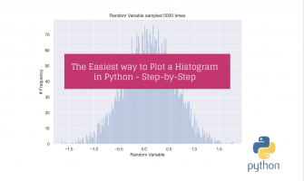
The Easiest way to Plot a Histogram in Python – Step-by-Step
by: onestop_data
Here you will learn the easiest way to plot a histogram in Python. We make use of the seaborn library to create the distribution.

Simple Box Plot and Swarm Plot in Python
by: onestop_data
This short tutorial teaches you how to create a box and plot whisker and overlap it with a swarm plot in Python. Furthermore, it shows how …

Confusion Matrix Plotting – The Simplest Way
by: onestop_data
This tutorial shows how to plot a confusion matrix in Python using a heatmap.

Pain-free Genome Depth Plotting
by: onestop_data
A genome depth plot is a great way to visualize how well a target genome is covered across the genome. This can be used to eyeball …
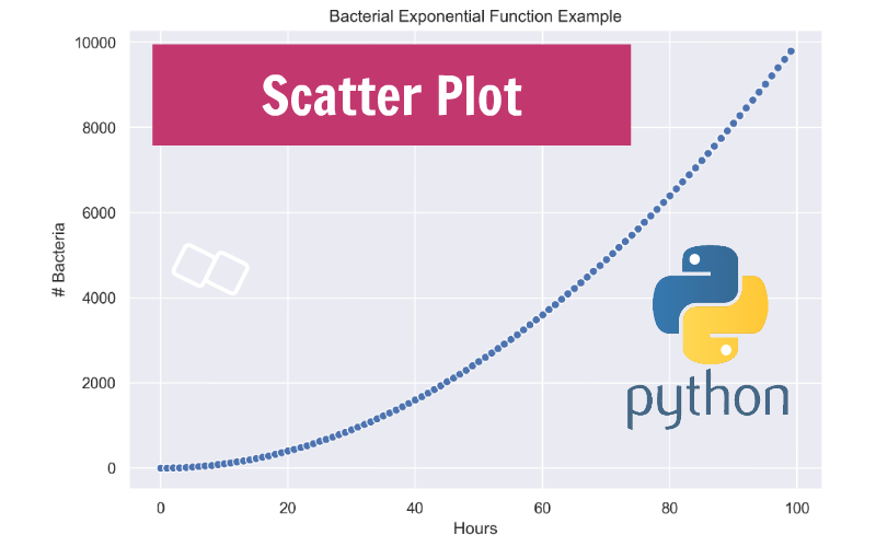
Simple Scatter Plot in Python
by: onestop_data
Generating a Scatter Plot in Python is probably one of the most common plots, and it can easily be accomplished. This tutorial shows using how using …

Effortless Recruitment Plot
by: onestop_data
Creating a recruitment plot can be a pain when you don’t have the right tool. A fragment recruitment plot is a great way to visualize how …

Data Science Careers carving our professional paths
by: onestop_data
Data science (or part of any of the data science careers) applies statistical procedures ranging from data transformations, data modeling, statistical and machine learning modeling, and …